
The Imagines logo integrates in one single design the interaction between different artistic expressions that shapes our project. A logo is an image that synthesises a concept. In this case, the challenge was to create a recognising concept that could transmit the idea of the dynamic dialogue between the ancient and the modern mediated by the arts. The logo is the outcome of the creative research and design work of our collaborators from Barcelona Ainize González and Nacho García, both art historians.
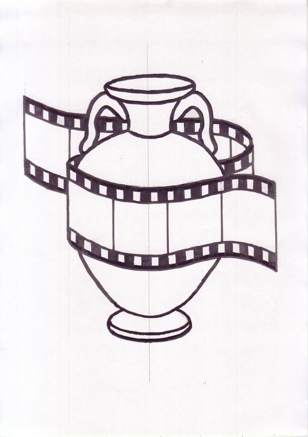
 Making of: The starting point that triggered the design was to find an element that through movement could express and link transversality and intermediality, both key concepts that define the work and aims of our research network. Figure 1 shows a still very schematic sketch of a celluloid, a tool that embodies both movement and image.
 On the next image (Fig. 2) we see a prototypical Greek amphora surrounded by celluloid that includes several ancient motives. Painting, theatre, dance and mythology are represented in this proto-design.
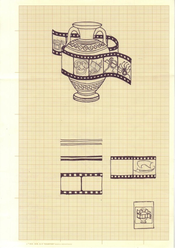 The next illustration (Fig. 3) expands this idea and displays the definitive proportions of the celluloid. Some geometric motives have been added on the amphora. The choice of the amphora is explained by its double functionality both as a pictorial support and as an artistic object per se.
 Fig. 4 brings together the concepts that had been considered in previous phases, but still does not whow a coherent narrative.
On the following illustration (Fig. 5), proportion and symmetry are aligned and one of the frames is removed in order to improve the geometric harmony of the design.
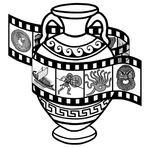
Figure 6 displays the definitive design. At both ends of the celluloid we see two static motives while those depicting dynamic elements occupy the centre of the composition, which aims to enhance movement to the object. The choice of these motives took into consideration the research interest of members and collaborators of Imagines.
 Performing arts and sculpture are represented by a theatrical mask; the Arch of Titus features monumental and urban architecture; the Hadrianic coin stands out as a symbol of the Roman Empire; it epitomises “official art” and the iconographies of power; the ship symbolises the ancient Mediterranean as a place of cultural encounters, travelling and dialogue; the inscription is the testimony of the memory of the past, while the painting and the mosaic perform not only as ornaments, but also as narrative elements that mirror society and everyday life.

© Ainize González and Nacho García. All rights reserved.
Finally, the red- and black-figure motives, which are inspired by the iconography of real Greek kraters, exemplify the central place that mythology plays both in Antiquity and in Classical Reception.
The image below is a diagram that comprehends all these ideas and displays the specific iconographic sources that inspired the figures.
![]()
 The logo fits into a frame that also includes a new typography. This element found its inspiration in the revolutionary designs of the Wiener Werkstätte, a strand of the famous fin-de-siècle Secessionist movement that aimed to unify the practical and the aesthetical. The typography, which is called Archeologicaps, has been created by the designer Manfred Klein, and presents reminiscences of Roman monumental epigraphy.
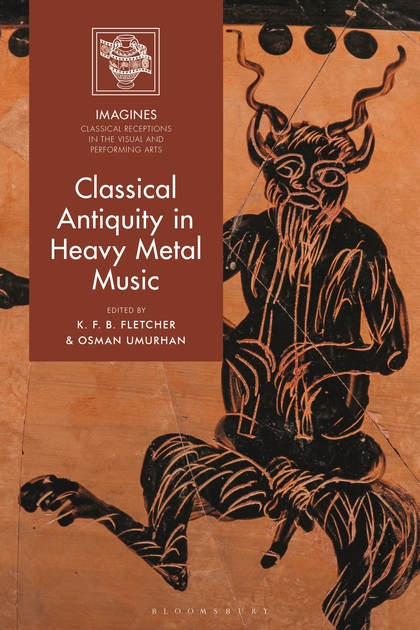
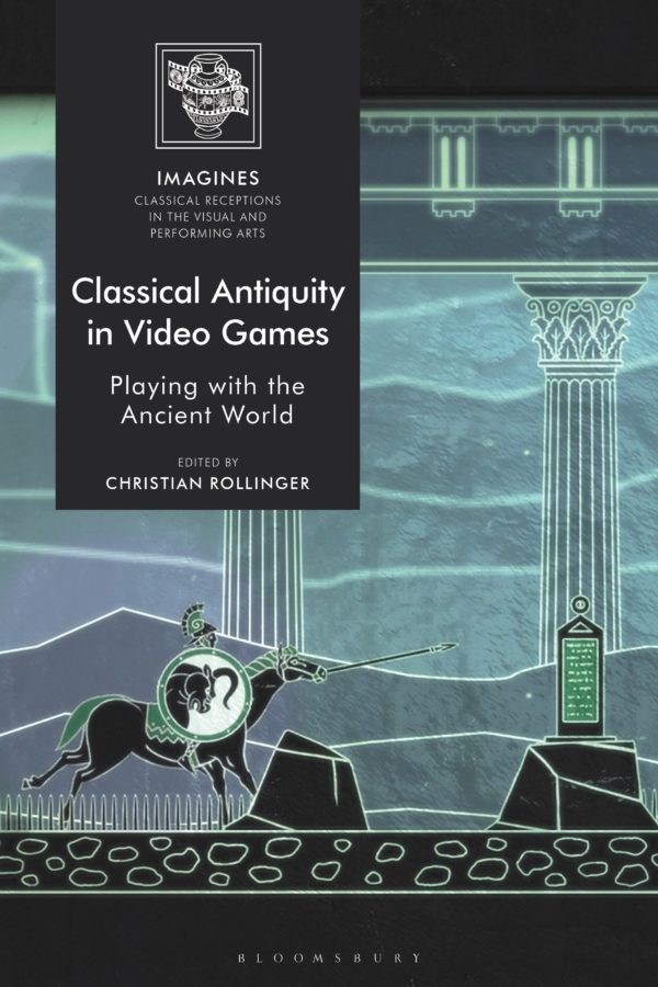
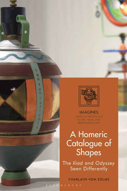
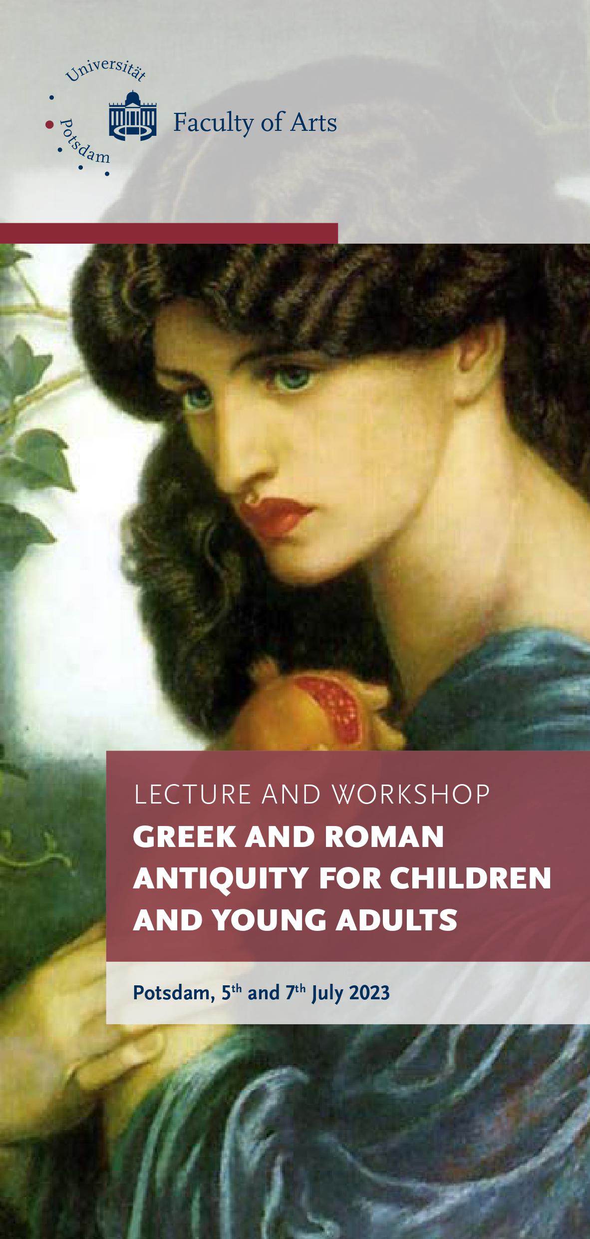
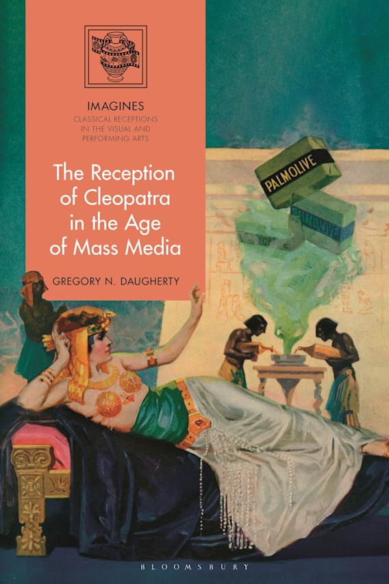
The Imagines logo features also now very nicely on the beautiful covers of the Imagines book series volumes, published by Bloomsbury (link to the series):